Controlled by Color: How Plates Affect Your Appetite
And the other sneaky ways tablewear is the unlikely influencer behind what you eat
Today’s post comes to you from Katy Kelleher, whose “The Ugly History of Beautiful Things: Essays on Desire and Consumption” was recently named one of NPR’s “Books We Love” for 2023. Her story below is part of our broader November theme: The Influence Appetite.
In early 2017, I became aware of Kendall Jenner and her paint choices. I don’t normally follow her family, but I do follow color trends rather obsessively. Baker-Miller Pink, Jenner explained on her social media, “is the only color scientifically proven to calm you AND suppress your appetite.”
I don’t think it’s a stretch to suggest that Jenner’s choice was probably more about diet than aesthetics. The decision was also based on a shoddy misreading of one scientific study performed on inmates. Baker-Miller Pink isn’t going to make anyone magically skinny, just as using smaller plates won’t make you eat less if you’re actually hungry. Our appetites are stronger than that.
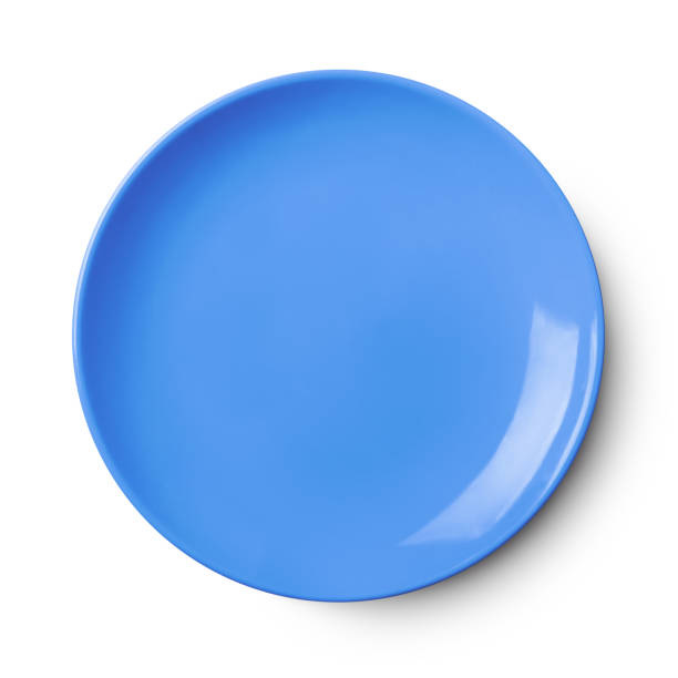
But outside factors do influence consumption. Where you’re eating, what your food is resting on, the music that’s playing in the room, and lighting can all change how you perceive a meal. It’s like an optical illusion; a little red steak surrounded by a big blue Fiestaware plate simply doesn’t look the same as that same piece of meat served on a tiny white porcelain dish. Our other four senses, from vision to smell to touch, all play a part in tasting.
And science supports this. When it comes to colors, both red and yellow are known to stimulate our appetites — which is just one of the ways a brand like McDonald’s can convince you to down 2,500 calories in a single sitting. Whereas a color like green promotes tranquility and, more recently, evokes organic, healthy eating in the mind of the consumer (yes, look no further than sweetgreen).
The same logic is often found in successful independent restaurants. Restaurateurs know the color hacks above, though as food stylist Catrine Kelty points out, “for many highly creative chefs, plating is intuitive. They aren’t necessarily thinking about it with the same analytic distance that I am.” For the most part, her rules are simple. She eschews polyester blend napkins, dislikes reflective plates, and advises chefs against using too many elements from one design era. “A mix of influences always feels more timeless,” she says. Kelty recently worked with the Portland Maine-based chef, Ronnie Medlock, on the opening of his new Puerto Rican-themed restaurant, Papi. When it comes to shooting food, Kelty jokes that her number one refrain is: Hand me a smaller plate. Followed by: Let’s mess it up. By putting standard portions on smaller plates, “you create a feeling of abundance,” explains Kelty, and the messiness gives it a sense of approachability.
Color, she admits, does matter. Allegedly, there was once an oft-cited marketing study where a group of diners were served steak, inside a dimly lit room, which obscured the color of the food. There’s something compelling about the idea that perfectly good beef, when dyed blue, becomes a nauseating prospect. According to the legend, when the light was brought up and the plate was revealed to be full of blue steak, several of the group lost their recently consumed lunches.
Hue doesn’t just bring horror; it can also enhance our appreciation of a dish. Kelty sings the praises of light blue and dark brown. “It’s a luscious combination,” she says. “It’s beautiful and sensual.” Chef Kathryn McCoart of Bar Vlaha in Brookline, MA also has a soft spot for blue dishes. “I honestly hate white plates,” she says. “I think you need more than white to make a dish pop.”
While McCoart uses textured earthenware plates in her restaurant—“I do rustic food your grandmother might make and the rustic plates keep it as close to tradition as possible”—she notes that most of her chef friends love “blue patterned plates.” (Think: willoware, Royal Copenhagen, or Delft blue.) “The main reason,” she explains, “is that not much naturally grows as the color blue. Most food is green, red, and yellow, so the blue really compliments the natural colors of the food.”
Cookbook author and recipe developer Vanessa Seder also cites blue dishware as a way to enhance the meal, but she adds that white, cream, and muted matte black can also help “frame” the meal. “The dishware should not compete visually.” She stays away from red and bright colors for the most part, and praises restaurants like Eleven Madison Park that use locally sourced, custom designed dishware to enhance the dining experience. Blue Hill at Stone Barns takes it even further, serving their farm-to-table dishes on china made with burnt cow ash, in the traditional English firing manner, from cattle raised and butchered on-site. It’s an old fashioned touch but it does add to the authenticity of the meal. You’re not just tasting the terroir of the vegetables, but even the dishware is imbued with a locavore spirit.
While none of these elements, from wall paint to linens, will make a bad meal taste good, they all add to the experience of eating. In some ways, they ask the diner to slow down and notice what they’re doing. “Not everyone will notice the dishes or the candleholders, but even if you don’t register them, they play a part in your experience,” says Kelty. “Why do we like a flambé crepe? It’s the oohs and ahhs. It’s the theater of food.”


